Visualising the 2022 Australian federal election with geom_sugarbag
Author
Matt Cowgill
Maps are great! But sometimes they can be a bit deceptive. This is particularly the case when the population density of a place varies greatly, as it does in Australia. Australians live in a small number of large-ish cities, with vast expanses of largely empty space in between them. This is a challenge to visualise.
For example, think of Australian federal electorates. Each one has roughly the same number of voters in it - a bit over 100,000. But they occupy vastly different amounts of space. This ABC News article does a good job of explaining this, pointing out that the electorates of Grayndler (32 square kilometres) and Durack (1.384 million square kilometres) each contribute one representative to our federal parliament.
In this post, I’ll show you how to make tesselated hexagon maps. These maps avoid the problems of a traditional choropleth map, by using icons (hexagons) of equal size for each area, while also preserving (to the extent possible) the geographic location of each hexagon. We’ll do this using the {sugarbag} package in R.
Show code
# Load packagespacman::p_load(tidyverse, sugarbag, sf)theme_mc_map <-theme_void(base_family ="Roboto",base_size =18) +theme(legend.position ="bottom",plot.title =element_text(face ="bold"),legend.title =element_blank(),plot.title.position ="plot",plot.caption.position ="plot",plot.caption =element_text(hjust =0,face ="italic"),plot.margin =margin(2, 2, 2, 2))theme_set(theme_mc_map)# Get data and shapefileresults_url <-"https://results.aec.gov.au/27966/Website/Downloads/HouseMembersElectedDownload-27966.csv"elec_results_full <-read_csv(results_url, skip =1, show_col_types =FALSE) elec_results <- elec_results_full |>select(ced_name_2021 = DivisionNm,party = PartyAb) elec_divisions <- absmapsdata::ced2021elec <- elec_divisions |>left_join(elec_results,by ="ced_name_2021") elec <- elec |>mutate(party_group =case_when( party %in%c("LP", "LNP", "NP") ~"Coalition", party %in%c("IND", "KAP", "XEN") ~"Independent", party =="GRN"~"Greens", party =="ALP"~"ALP",TRUE~ party ))party_cols <-c("ALP"="#F00011","Coalition"="#080CAB","Independent"="grey80","Greens"="#439547")plot_sub <-"Results of the 2022 federal election (House of Representatives)"plot_cap <-"Source: AEC. 'Independent' includes minor parties."
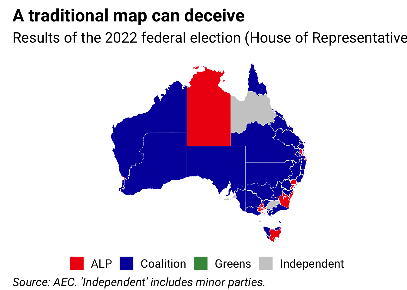
This map shows the problem pretty clearly. This is a map of the 2022 Australian federal election, showing the winner of each seat in the House of Representatives.
It looks like a sea of blue - to look at this map you’d think the Coalition had nearly swept the board. But, of course, that’s just because the Coalition tends to win rural and regional seats, which take up more space and are more visible on the map, while the ALP and Greens win more seats in the cities, which are less visible.
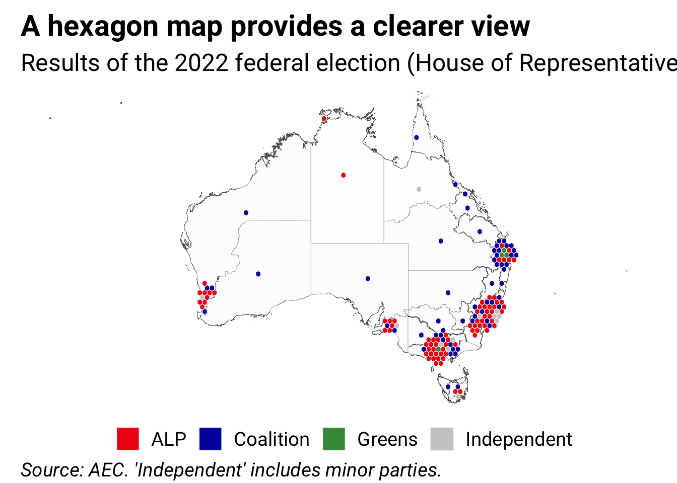
For a more informative map, we’d want to give equal visual weight to each electorate. But we also want to make a map, meaning we want to retain the familiarity of the standard map.
The {sugarbag} R package by Stephanie Kobakian, now maintained by Di Cook, provides a solution to this problem. For each area on the map, it generates a hexagon, and places that hexagon on the map in an appropriate place. It keeps these hexagons as close as it can to the actual geographical areas, and also preserves each hexagon’s relationship to the capital city centres. I’ve added a new function to this package - geom_sugarbag() - that streamlines the process of making hexagon maps.
Here’s the same data shown above, but this time as a {sugarbag} hexagon map: